
Category: Autumn Assessment 2015
Curating development
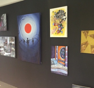
My group all had paintings which related through their theme of surrealism. We decided to display our paintings together so that they were viewed in relation to one another- similarly to Nicholas Serota’s exhibition style in the Tate Modern. In order for our paintings to stand out and look visually exciting, we painted the wall black and staggered the paintings across the wall with the largest in the middle.
Statement
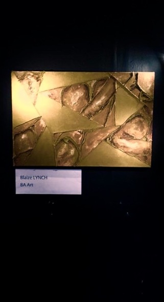
In this project I re-created a piece of descriptive text in to a painting that could either illustrate or replace the original text. The text focus’ on a ‘copper giant’[1] with ‘immense form,’[2] and ‘overwhelming intensity.’[3] I wanted to reciprocate these quotes as visuals and feelings through colour, form and texture. Along side my own interpretations of the text and initial ideas I had imagined, artist influences became prominent in my process.
Looking at art in the the 20th Century led me to combine two important art focus’ of that time- The extensive use of gold paint, and the Cubism movement. Gold was a sign of sacred power and importance, which links directly to the theme I intend to portray. One of the key influences on my work has been Yves Klein’s gold paintings, Klein uses gold to “impregnate the painting and give it eternal life.”[4]
Influences from the Cubism movement allowed me to re-think ideas of how to present a large scale figure without painting on a huge scale. Similar to Pablo Picasso cubism style, I have split the the canvas into sections revealing only parts of the figure instead of a whole image- which I intend to be more intriguing for the viewer. The alternate sections are painted gold to put emphasis on the choice of colour and its qualities. Through this combination I hope to reveal the idea and presence of a ‘giant copper being.’[5]
In order to create a better sense of life and movement into my painting, I used gold painted string to separate the sections and add textural detail to the form of the figure- this material is suitable because of its flexibility to create straight and bent lines. The combinations of sections of gold paint with contrasting imagery of a copper body, lined with twists of gold string outlining detail merge together to be viewed as a whole.
[1] Fantasy artwork descriptive text “Copper Man.”
[2](Ibid)
[3] (Ibid)
[4] http://mediation.centrepompidou.fr/education/ressources/ENS-Klein-EN/ENS-Klein-EN.htm#or (accessed 30/11/15)
[5] Fantasy artwork descriptive text “Copper Man.”
My descriptive fantasy writing
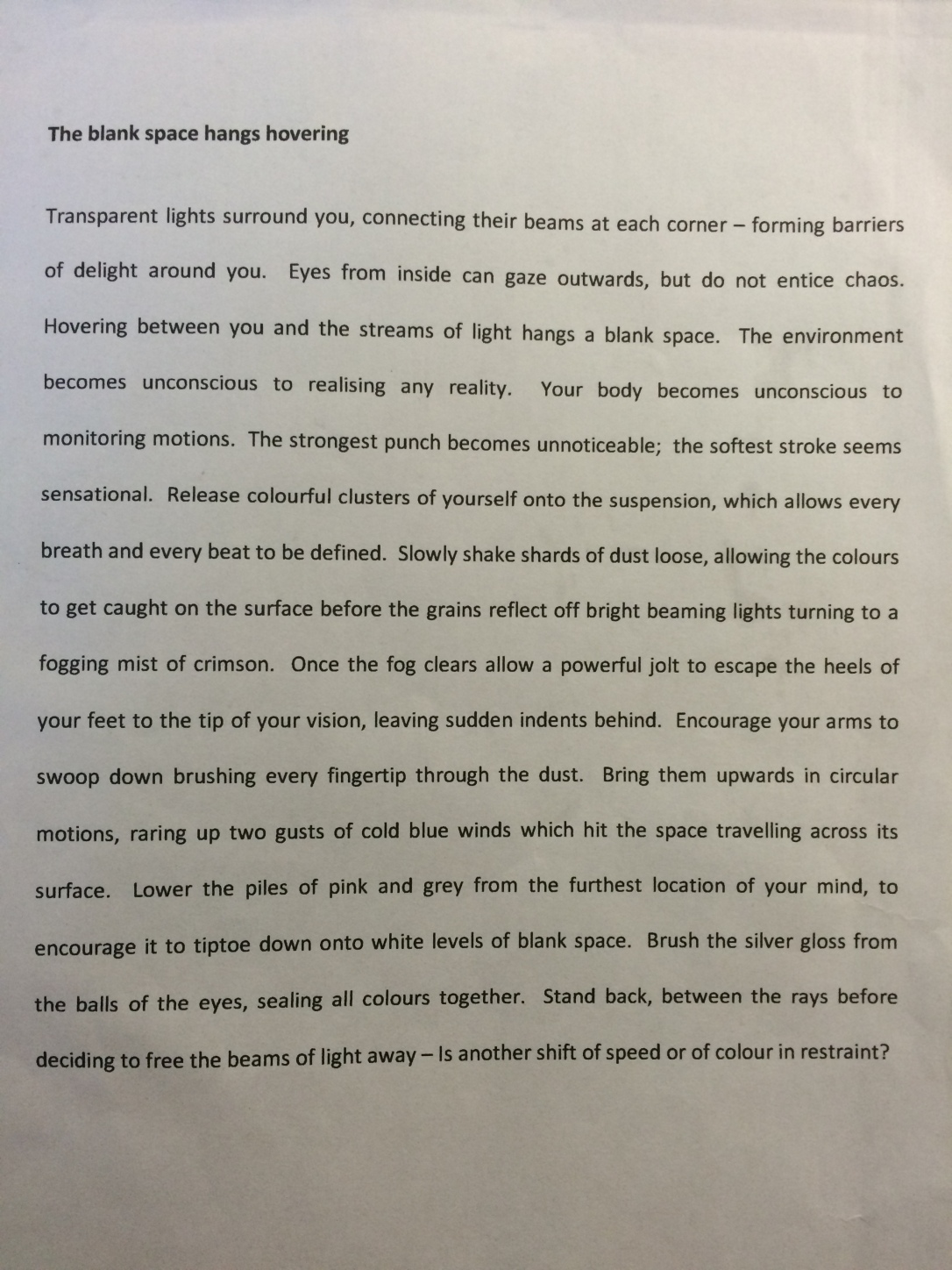
This is my own descriptive writing text based on an abstract visual thoughts
‘Copper Man’


This is my final painting on the canvas I made in the previous weeks. I managed to subtly unify the sections by using string painted gold to add detail and dimension. I also mixed small amounts of gold paint with acrylic to allow the sections of the body to blend more aesthetically with the sections of gold.
Process and development

initial sketch ideas

more detailed sketch idea

mock piece on large scale

testing colours on mock pieve
After reading my peers Fantasy descriptive writing, I began drawing out initial sketches and ideas. I then started exploring different media to paint with. For my mock paintings I used makeup to paint with, hoping for an interesting texture created to portray skin. From this test I realised makeup as a media doesn’t allow much depth to be created. Because I had not used gold paint before, I was unsure wether it would compliment the colour of the skin. From these tests, I noticed that the two colours are surprisingly very different and somehow need to overlapped or combined to unify the surface.
Fantasy artwork descriptive writing
After swapping texts with another peer, our task was to create a painting from the information described in the text. I was given a piece called ‘Copper.’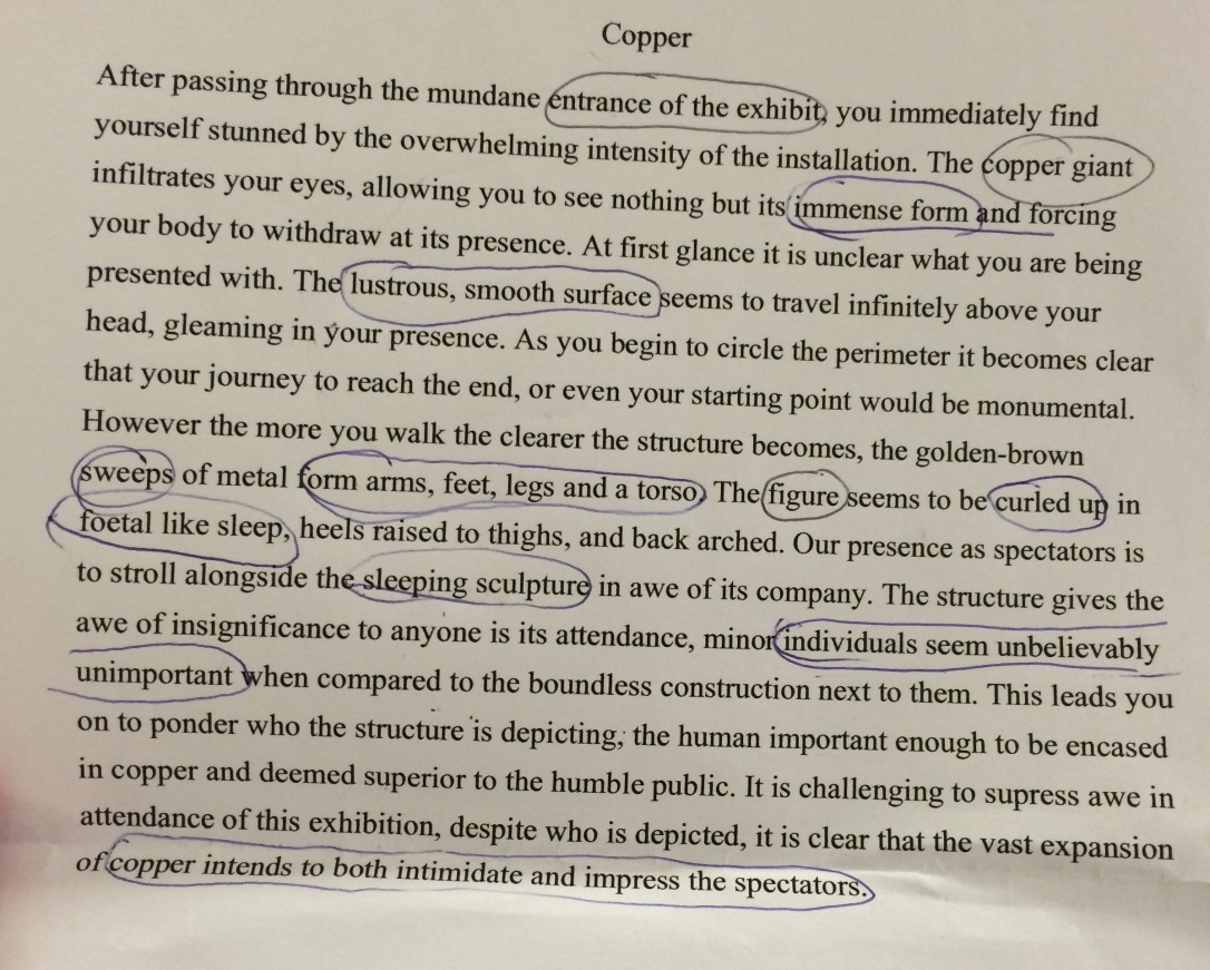 To begin the process of turning this text into a painting, I have focused on the most prominent parts of the information and found 3 artists who have created work that I consider relates to how I will interpret the text.
- Giacambo Balla- Street light 1909- the relation of painting technique used to create the manmade object as powerful and amazing.
- Ella and Pitr- French artist murals of large scale body’s on roofs of buildings and walls. Relates to the main topic, a ‘copper giant.’
- Hannah Hock- Collages of bodies using rearranged images- a technique I could use as inspiration for painting on an average size canvas while keeping the illusion of a large body present.

My Artist Manifesto
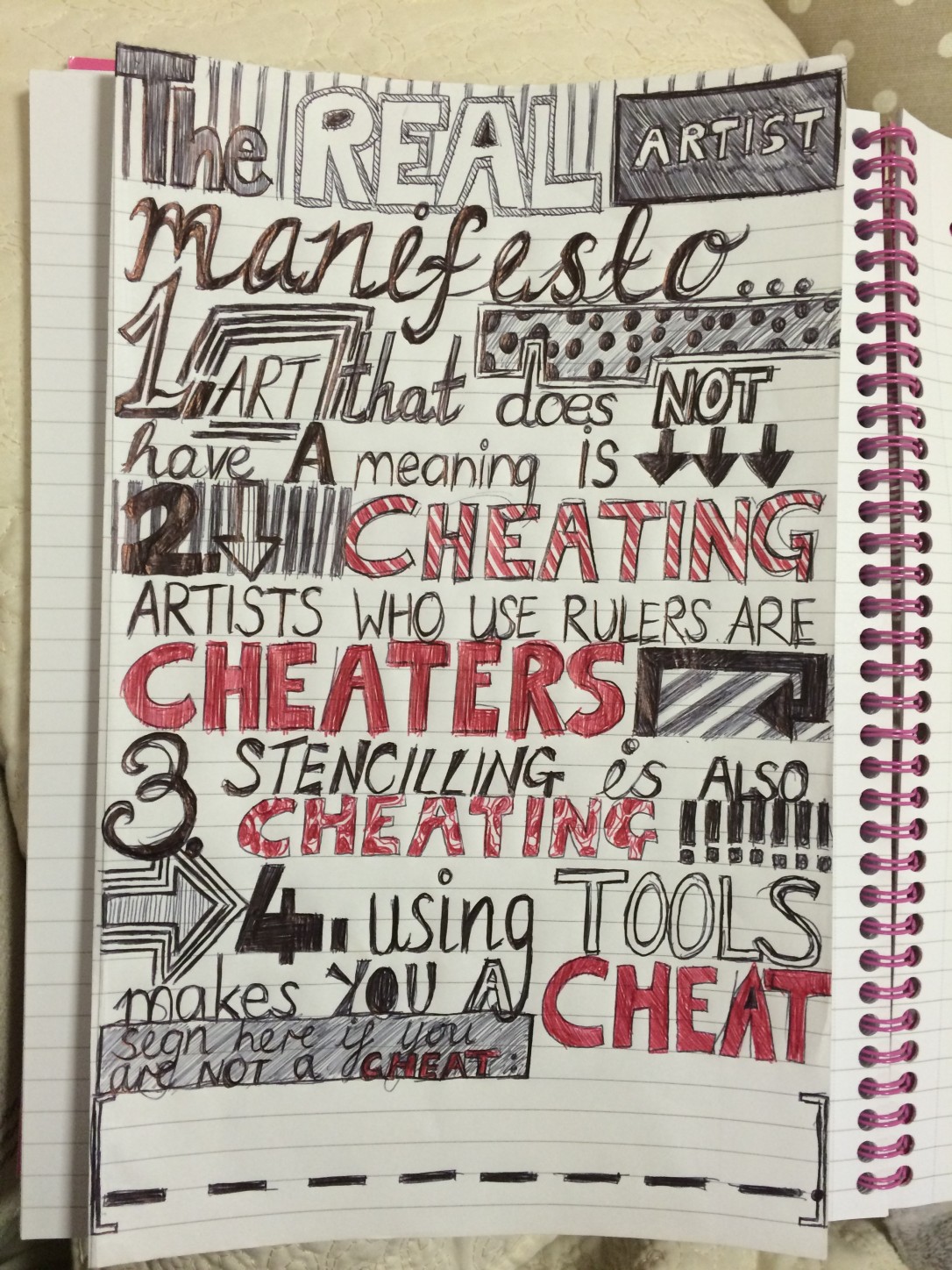 My Artist Manifesto- ‘The REAL Artist Manifesto,’ sums up in a blunt but humourous way what I think makes an Artist a cheat. Choice of typography style came from research and a mixture between pre-modern and modern styles. I combined them to create a strange contrast of my own. I used Influences from Paula Schek’s typography, which allowed the text to carry spirit and meaning.
Propaganda Poster


Creating propaganda poster using screen printing technique along side some sponging. First step was drawing out the design, then using a scalpol and cutting mat to remove sections intended to pick up the ink. Important thing to note- some letters need editing to make sure they are still legible and do not become detached as a whole from the rest of the poster; for example, letters ‘O’ and ‘D.’
I chose to focus my subject of propaganda on a issue myself and the exhibition viewers could relate to- University fees.
Installing the posters into the exhibition space consisted of simply nailing the corners into the studio wall alongside an array of peers posters. Both walls were full and the room was dimly lit with bright light shining onto the work. The exhibition was very successful.
